Bento Grids: A modern approach to creating attractive and responsive web design
Revealing a modern approach to creating attractive and responsive web design using Bento Grids. In an effort to strengthen design effectiveness and enhance user experience, we have turned to this innovative technique. Here is our perspective on how Bento Grids can elevate your website to a new level.

Main Points
- Introduction to Bento Grids
- Benefits of using Bento Grids
- Implementation of Bento Grids on websites
- Examples of successful use of Bento Grids
- Conclusion: The Future of Bento Grids
Introduction to Bento Grids
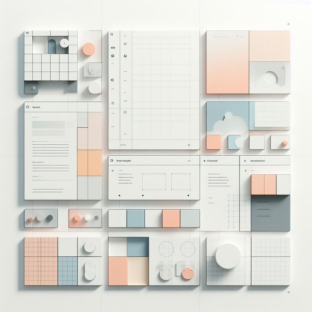
Bento Grids, or Bento grids, are a modern method of organizing content on web pages. They are based on the principles of flexible and grid-based design, allowing for quick and easy adaptation of layouts for different devices and screens.
Benefits of using Bento Grids
The implementation of Bento Grids brings several advantages. One of the main advantages is the improvement of your website's responsiveness. With Bento Grids, your content can dynamically adapt to the screen size, ensuring a consistent and pleasant user experience, regardless of whether your visitors access it via mobile, tablet, or computer.
In addition, Bento Grids also allow for better organization of content. With their help, you can easily arrange and segment information on your page, increasing clarity and improving navigation.

Implementation of Bento Grids on websites
Implementing Bento Grids is not complicated. There are many tools and frameworks that can help you get started. For example, using a CSS framework like Bootstrap or Tailwind CSS, you can quickly integrate Bento Grids into your project. These frameworks provide ready-made components and styles that make your work easier. Additionally, you can also use custom CSS rules to create your own Bento Grids. The flexible nature of Bento Grids allows for a high degree of customization according to your needs, which we consider a huge advantage.
Examples of successful use of Bento Grids
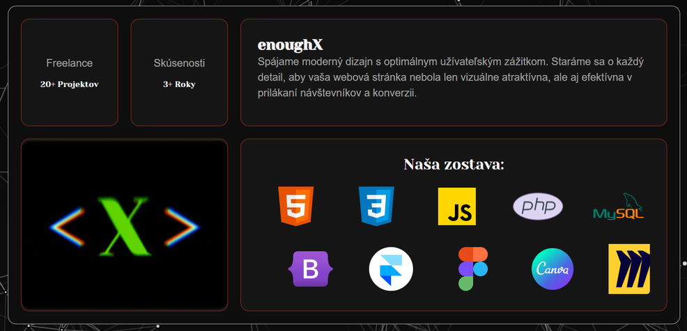
We at enoughX have decided to implement Bento Grids on our website. The new design has improved overall clarity and user experience, as visitors were able to find the desired information more quickly.

Similarly, other companies, such as Apple and Bolt, have implemented Bento Grids not only on their websites but also in presentations. Their stories attest to the fact that Bento Grids are truly an effective tool for creating attractive and responsive designs.

Conclusion: The Future of Bento Grids
Bento Grids are becoming an integral part of modern web design. Their flexibility and ease of implementation make them an ideal tool for designers and developers. With the increasing number of users accessing websites through various devices, it is important to have a flexible and responsive design, and that's exactly what Bento Grids provide.
In conclusion, we can say that Bento Grids are not only a modern design technique, but also an essential tool for improving user experience and the success of your online business. It's time to start leveraging their potential and take your website to the next level. Contact us at enoughX and we will help you with Bento grids!

